Bam! Pow! Zap! Xavier Files isn’t just for X-Men anymore! In case you missed the memo, the site you love is now covering the wider comics industry. And so this week we have a roundup of reviews from across the indie spectrum, including Benjamin “X-Force” Percy’s latest crime thriller (reviewed by Zachary Jenkins), Mark Russell’s eat-the-rich satire (reviewed by Vishal Gullapalli) and Vault Comics’ horror darling (reviewed by Dan McMahon). Enjoy!
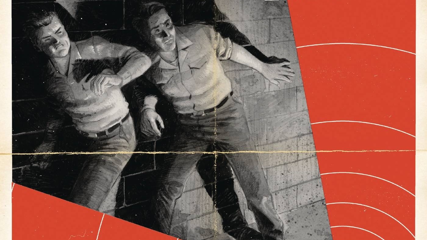
Devil’s Highway #1
Writer: Benjamin Percy, Artist: Brent Schoonover, Colorist: Nick Filardi, Letterer: Sal Cipriano, Publisher: Artists Writers & Artisans

There’s been an upswell of new, independent publishers over the past few years, all of which positioned themselves as an alternative to the cape-filled corporate world of Marvel and DC. Without the backing of the major IP of the Big Two, it’s deeply important for each of these publishers, and each title they put out, to have a clear, concise reason for existence. It needs a hook, a gimmick, some reason to stand out in an increasingly homogenized field.
Benjamin Percy, Brent Schoonover and Nick Filardi’s “Devil’s Highway” from AWA doesn’t have any of that. It’s a boilerplate murder script about the mysterious goings-on in a Midwestern town. The lead character, Sharon, could have come from any number of books. She’s the town tough girl with the undercut and the pink streak in her hair, who put the high school jocks in intensive care for copping a feel, and she’s on a mission to find her father’s killer. Nothing will stop her, not the police officers she’s known since high school, nor the transphobic, backwoods gas station attendant she runs afoul of. She is indicative of this tale as a whole. Just looking at Percy’s body of work, there are pieces of his novels, his “Wolverine: The Long Night” podcast and his run on “Green Arrow” strewn throughout this work, not to mention influences like “Fargo.” It’s a story that’s been done before, and better.
Schoonover’s art is appropriately down to earth. It wants to be realistic, dark, moody and formal. He’s given long stretches of page without dialogue, thrusting the book on his capable shoulders. It’s not bad, it’s quite nice to look at, but like the rest of the book, it’s plain, normal, forgettable. In a market stuffed to the brim with extraordinary, there’s no reason to pay attention to a book as plain as this.
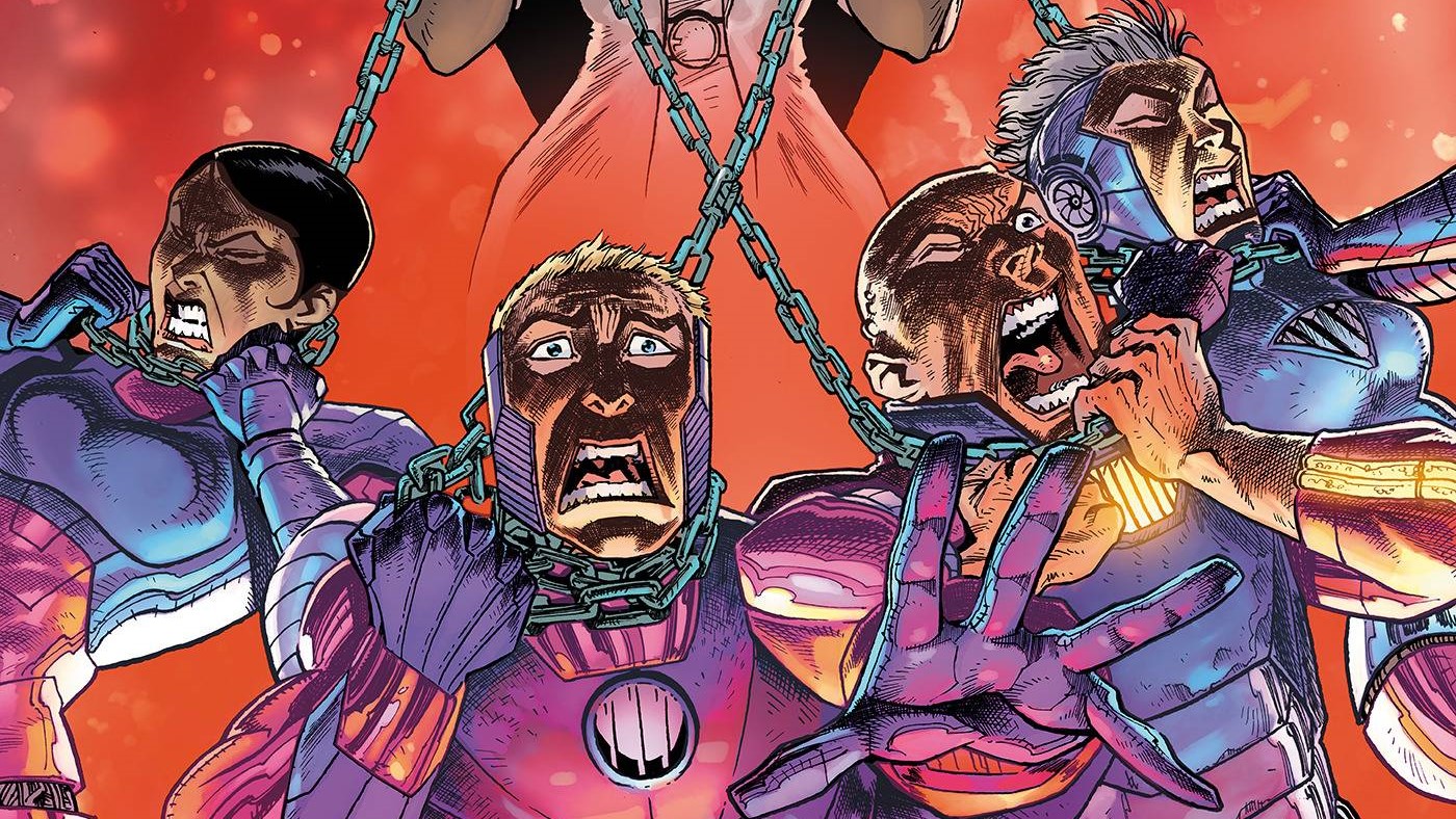
Billionaire Island #2
Writer: Mark Russell, Artist: Steve Pugh, Colorist: Chris Chuckry, Letterer: Rob Steen, Publisher: AHOY Comics

I’ve been sitting here for half an hour staring at a blank page trying to figure out how to write about this book.
Let’s start with the facts. “Billionaire Island” #2 is a comic book by Mark Russell, Steve Pugh, Chris Chuckry and Rob Steen, and is about a future where billionaires run the world even more blatantly than they do now. In classic Russell fashion, it’s biting satire with a very visible sense of disdain for the terrible things our society has created and perpetuated.
All this is good – the entire premise of the series is good, Russell’s satire is really enjoyable and the protagonists of the book are honestly really compelling in their motivations – especially the one specifically out to kill all the billionaires responsible for his family’s death. Russell manages to reach a level of satire that’s clear without feeling uncomfortable – it’s more infuriating that the things he’s writing feel like natural extensions of the world we live in than anything else. It’s something he’s always been good at, and having Pugh as his artist helps as well, as his art is always able to bring out the emotions and fine details that make Russell’s biting criticism feel that much more meaningful.
The problem comes down to the fact that, honestly, nothing happens. It doesn’t help that this story is 20 pages, two fewer than a standard comic at the Big Two, but even with two extra pages this issue would still feel very lightly packed. There’s a lot of page time spent on reiterating the same things the first issue did. People at the mercy of billionaires will grovel if it means they get treated slightly better than someone else, the elite don’t care about anything except their own profit, all the things that were perfectly illustrated in the first issue have been restated in this one, to the point of redundancy. This would have been the perfect issue to move the plot forward a bit instead of continuing to illustrate an already clear view of this dystopia.
Honestly, I’m really just waiting for this book to get into something that feels like retribution soon, because I think what it’s missing the most is a satisfying crunch with all of this exposition and buildup. The only real problem with the issue is that I don’t have more to say, because this premise is incredibly poignant. It might read better in trade, though – or at the very least, when we don’t have a several months-long gap between 20-page installments.
The Plot #5
Writers: Tim Daniel, Michael Moreci; Artist: Joshua Hixson, Colorist: Kurt Michael Russell, Letterer: Jim Campbell, Publisher: Vault

After a bit of a break in the publishing schedule, “The Plot” is back to deliver its most unsettling tale yet.
Diving deeper into the Blaine family gene pool to find the roots of the monster dragging the family down is a terrifying prospect. This issue goes back to 1674, where the Blaine family mantra, “In order to receive, first you must give,” originates.
Co-writers Tim Daniel and Michael Moreci continue to be a powerhouse horror duo. The themes of “The Plot” are on full display at both a macro and a micro level. The monster as it appears in this issue is a beautiful, lovecraftian horror lurking below the surface of the world we know. While we do not understand it fully, this issue shows us more of how it interacts with the world around it. The scarier aspect is the examination of control and the lengths humanity will go to find it. The flashback revolves around the town of Cape Augusta during a year of drought and near starvation. POV character Vitus Blaine shows us the lengths one will go to provide for the ones they love.
Joshua Hixson’s art is as stylized as ever, bringing an eerie sense of dread to every panel. The expressions of characters’ dread and other feelings are beautifully illustrated. Jim Campbell’s lettering works fluidly with the story, especially the discolored bubbles he uses when characters talk to themselves.
New colorist Kurt Michael Russell uses a variety of color palettes that express a lot about the story. Russell displays the winter months through cold blues, grays and whites that give weight to a village on the edge of famine. The lack of color puts on full display that these people are dying with no hope for a future. An otherworldly set of green and purple drips from every panel where the supernatural elements creep into view. The vivid purple that blankets Vitus Blaine’s descent into the unknown is a vision to behold as you journey with him toward an unknown horror on the edge of the known world.
The sheer amount I have spoken about “The Plot” this year is immeasurable. That one-man hype train only picks up speed with issue #5.

Zachary Jenkins co-hosts the podcast Battle of the Atom and is the former editor-in-chief of ComicsXF. Shocking everyone, he has a full and vibrant life outside all this.

Vishal Gullapalli is highly opinionated and reads way too much.

Dan McMahon is a life long hunk. Most of his time is spent writing about things he loves, tweeting about Willem Dafoe, and his podcast GateCrashers.